 Production-Education-Research
- Home
- Design
- Research
- Contact
It’s ironic that this play of happenstance and consequences, a precisely written farce, demands that the designer is doubly exacting and makes no human errors. Shakespeare delights in the form and the ‘The Comedy of Errors’ is as fresh as Feydeau and contemporary as Cooney, with just a dash of Joe Orton’s black humour. Comedies of this sort that, on the page, imply intense and precise physicality in the staging, require a design that maps out the action and anticipates the journey times from any given point on the stage to another. Entrances should be a surprise and exits swift – no character outstaying their welcome for a split second. Aesthetically, they also need to take the audience into a familiar but not necessarily realistic world – hyper-reality perhaps, to match the escalating energy of the narrative in performance.
Propeller Theatre always tries to bring the 16th Century closer to the 21st by overlaying the footprint of one upon the other and exploit how Shakespeare’s characters negotiate the timeless human situations he has dealt them. In conceiving our unique world for the story, we had to find for ourselves an island community with it’s own laws and superstitions; as haunted as Prospero’s island and as potentially volatile as our own on a boozy Saturday night. Ephesus should therefore be a multicultural crossroads where all manner of unlikely folk are ‘washed up’ in all senses of the word and where eating, sex and commerce are the prime preoccupations of its entrapped population.
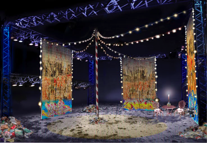
Scenic design for ‘The Comedy of Errors’ [Digital rendering]
Obvious then: a run down piazza in a run down port in a Tenerife or Capri lookalike (apologies to the actual inhabitants). ‘Look-alike’. Stags and Hens, police corruption and black market racketeering are the everyday and anyone can loose themselves in the margarita-fuelled 24-7 holiday spirit. Lookalike – there are no ‘genuine parts’ here, everything looks like it might be the real thing, but it’s become a fantasy island; a fake. That is until the miraculous appearance of Antipholus and Dromio of Syracuse who are genuinely mistaken for their respective long lost Ephesian twins. So the design brief to myself was that everything the audience sees should be a sham, a façade, a representation of something we should truly recognise and value… in other words, profoundly theatrical.
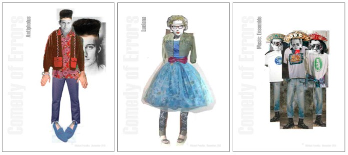
Costume designs for ‘the Comedy of Errors’
The character’s clothes were an eclectic pan-European mix and the locals merged into the shadows behind aviator sunglasses reflecting stranger’s personas back on themselves, under the brims of kiss-me-quick sombreros and indentified only by the partisan heraldry of the soccer shirt they are sporting and their footballing hero’s name replicated across their less than broad shoulders. Technicolor, festoons of bulbs, some missing like the teeth that had been knocked out in an early morning bar brawl, graffiti, and the only other unifying brushstroke being that most characters wear a shade of blue on their lower half, and so embody a continually shifting seaside horizon.
There is something very satisfying about designing a formal arrangement of architectural surfaces, not necessarily symmetrical but nevertheless clean and strong: counterpointing the mayhem of the play that can disrupt or even destroy its harmony. Shakespeare’s usual implicit arrangement of three entrances and exits on three sides or, as at the Globe, set into the a single upstage tiring house with a central balcony above, is a formula for the scenic architecture that designers ignore at their and the production’s peril. Propeller’s Ephesus mirrored this exact plan so that exits and entrances stretched an entering actor’s journey across the stage, allowing for plenty of time to improvise en route, before building up a dangerous head of steam to make a super-fast exit. Doors themselves rarely play a big part in Shakespeare’s staging, he having emerged from a culture of non-building based venues such as courtyards, but they’re great for farce, of course. So our design of three double-height metal shop front shutters splashed with undecipherable scribble and inset doors that smacked shut with an echoing rattle, helped fuel the production’s urban frenzy. This design aimed to keep the performance on the edge of reasonable control and where calamitous human error was always, possibly, just around the corner.
This article appears in the Propeller Shakespeare play text of ‘The Comedy of Errors’ Oberon Books ISBN: 9781783190119